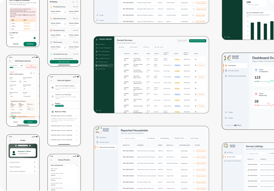
Reduced duplicate survey records by ~75% through GIS validation.
Municipal property surveys were slow, error-prone, and producing duplicate records. I redesigned the entire workflow — from how surveyors collect data in the field to how administrators sign off at scale.
The Situation
An existing system that wasn’t working for anyone
E-Netra was brought in to redesign an existing property-survey application for CRUXA Group and Nagar Palika Parishad. The original app had one long, undivided form — twelve to fifteen steps with no sections and no progress tracking. Surveyors working in the field, moving from property to property all day, were losing progress and abandoning surveys midway.
Beyond completion, there was a deeper problem: the system had no way to catch duplicate surveys. If two surveyors visited the same property, both records would enter the system — nobody caught it until the data review stage.
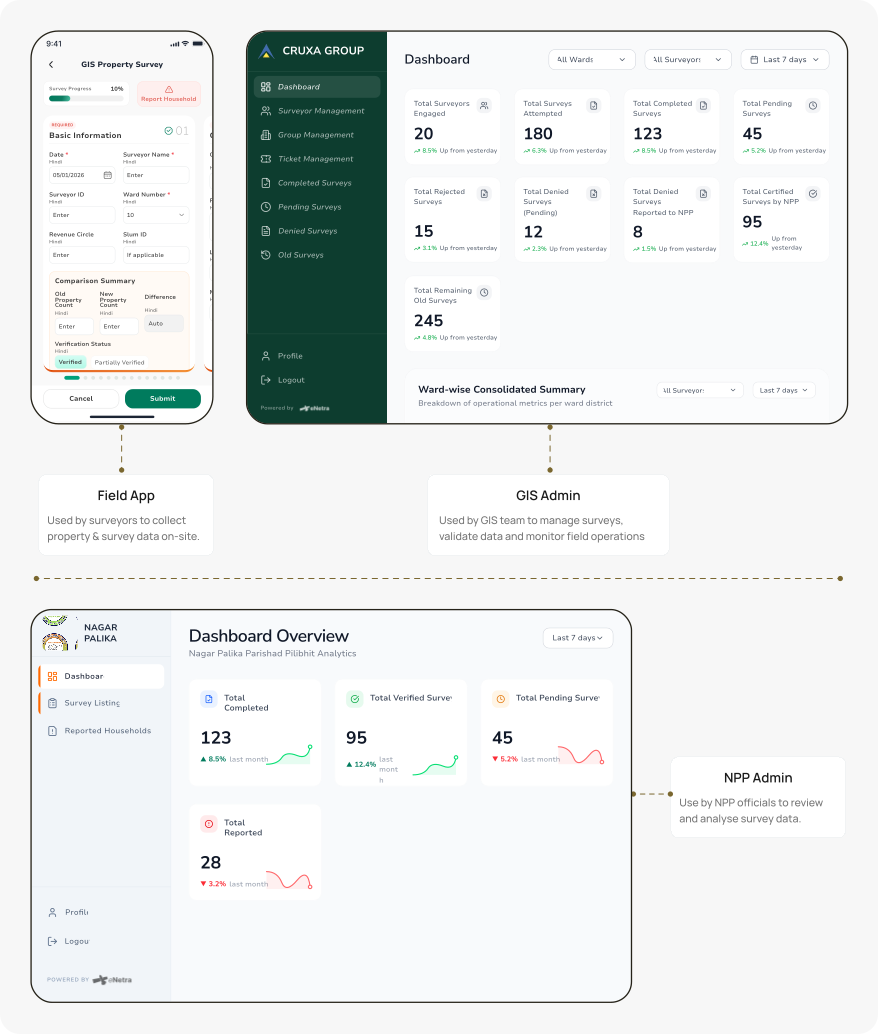
The redesign had to serve three groups with fundamentally different needs: surveyors collecting data in the field, GIS teams managing survey operations, and Nagar Palika Parishad teams overseeing progress and sign-off. Building one product that worked for all three wasn’t possible — so I didn’t try.
Impact
Made large-scale GIS surveys faster and more reliable
~75%
Fewer Duplicate Survey Submissions
GIS property validation prevented redundant records before they were created.
~30%
Faster Survey Completion Flow
Section-based forms reduced navigation effort during long field surveys.
2
Dedicated Operational Systems
Separate GIS and NPP Admins gave each team the tools they actually needed.
3X
Faster Dashboard Workflow Iteration
AI accelerated dashboard design while product decisions remained human-led.
Core Decision
One dashboard couldn’t solve three different problems
Surveyors needed to collect data. GIS teams needed to manage operations. Municipal teams needed visibility.
Putting all of that into one dashboard would’ve made every workflow more complicated.
Instead, I designed three focused products around the people using them:
Field App → fast, guided survey collection
GIS Admin → day-to-day survey operations
NPP Admin → reporting, monitoring, and administrative oversight
The goal wasn’t more dashboards—it was less complexity for every team.
Field Survey App
The hardest part wasn’t collecting data—it was keeping surveyors moving.
Surveyors spent most of their day moving from one property to another. Stopping to navigate long forms or search for information slowed the entire process.
Instead of redesigning the UI, I first simplified the workflow.
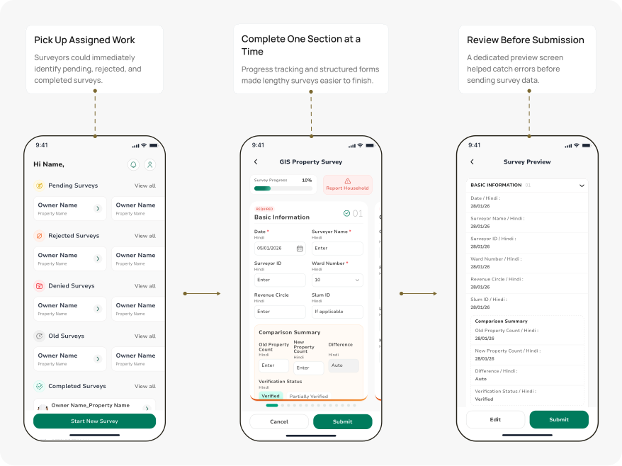
The original app presented everything as one long form — no sections, no indication of how far along you were. I restructured it into smaller sections with clear progress, letting surveyors focus on one part at a time instead of one overwhelming scroll.
The redesign included:
Section-based navigation
Swipeable form flow
Progress tracking
Context-aware inputs
When a technically correct solution isn’t good enough
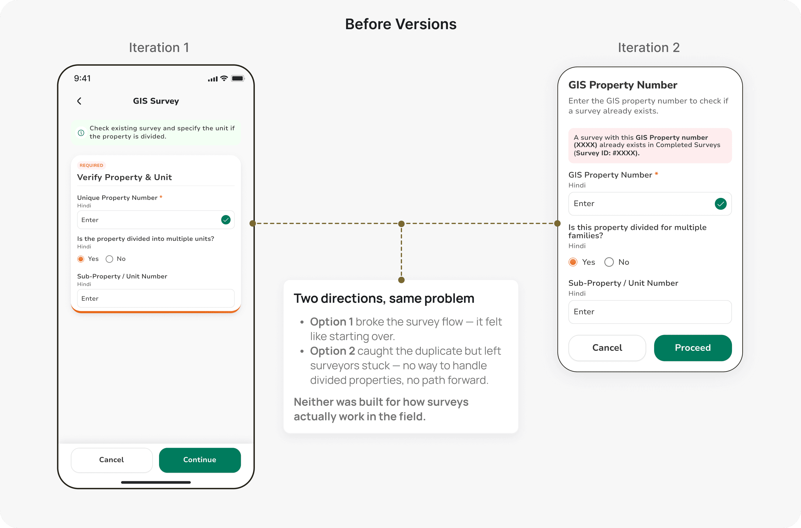
No validation existed in the original flow. Surveyors could visit the same property twice and both records would go in — only caught at the data review stage, when fixing it was slow and manual.
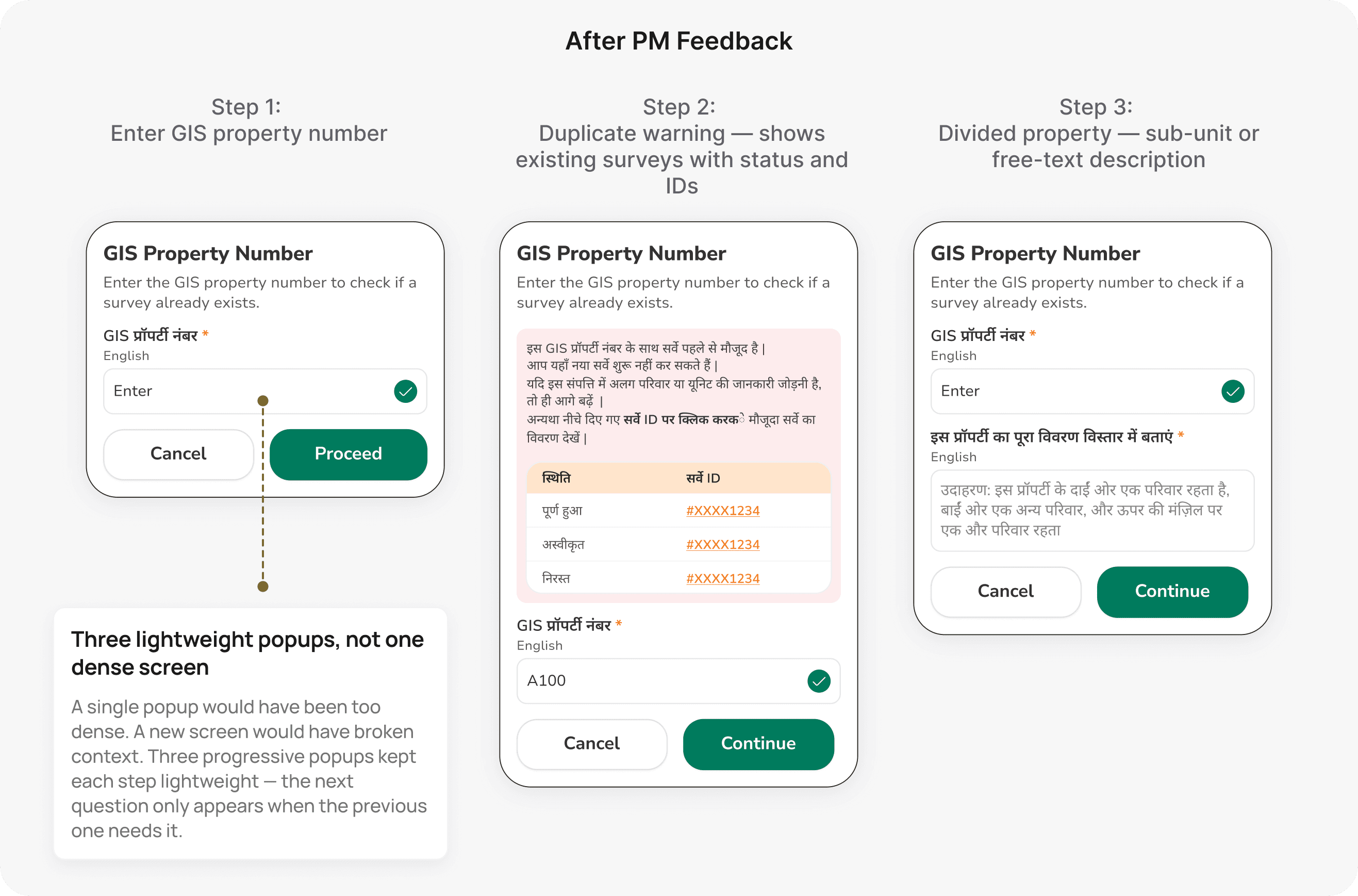
My first version was a simple popup: enter the GIS property number, see whether a survey already exists. Technically it worked.
But my PM pushed back. Surveyors work in the field, often in Hindi, and aren’t comfortable reading dense English text on a small screen. A plain lookup popup would get dismissed or misread in practice.
So I rebuilt it as a three-step flow, in Hindi:
A duplicate warning showing existing surveys with their status and IDs — not just a yes/no, but which surveys exist and what stage they're in
A question about whether the property is divided among families — divided properties are a legitimate reason to survey again
A sub-property or unit field for capturing the correct detail and moving forward
This is the moment I’m most glad I didn’t ship my first version.
The goal wasn’t to make the form look better. It was to make long surveys feel easier to complete.
Designed Manually In Figma
Product decisions were driven by field usability and workflow thinking rather than AI-assisted generation.
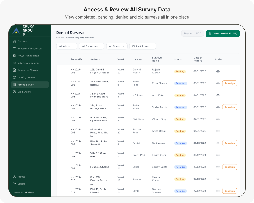
GIS Admin
Managing surveys became more complex than collecting them
Once surveys started coming in, the challenge shifted from collecting data to managing it.
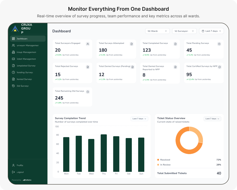
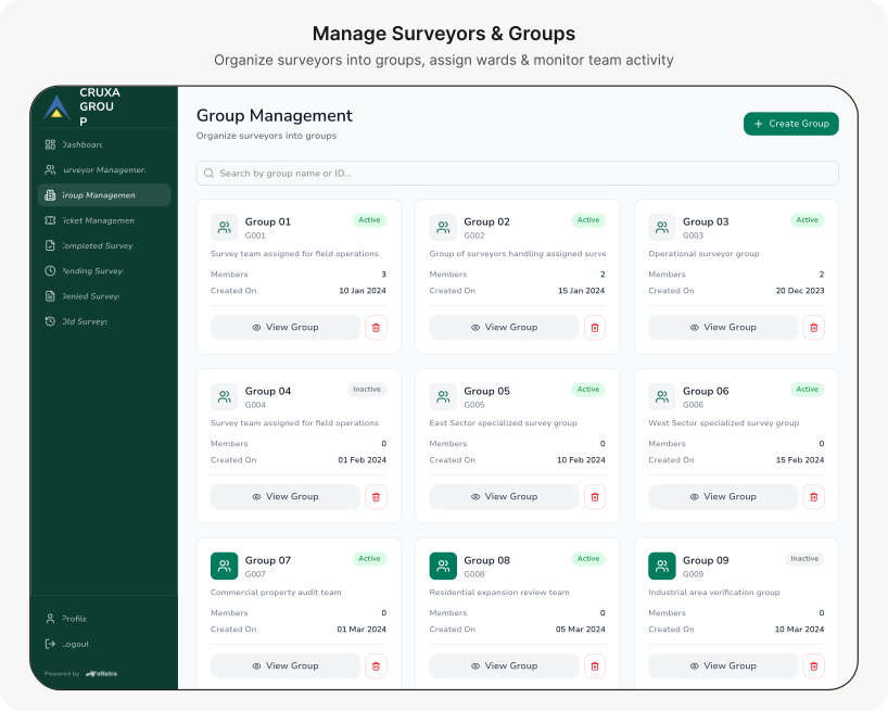
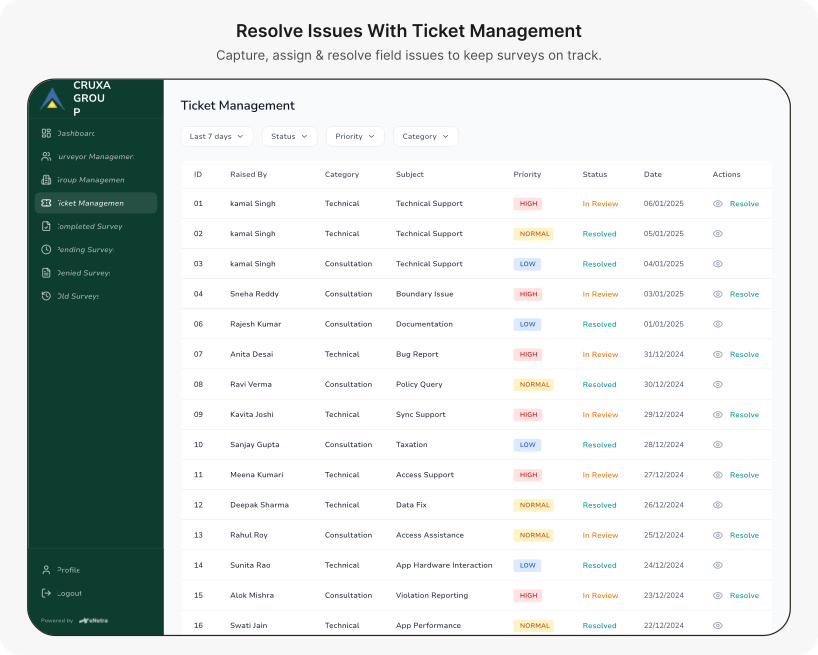
Designed using Figma Make, I rapidly explored operational workflows while focusing my time on product decisions instead of repetitive dashboard layouts.
The platform helped teams:
Monitor everything from dashboard
Manage surveyors and groups
Resolve issues with ticket management
Access and review survey data
The goal wasn’t a better dashboard—it was cleaner survey data.
AI Accelerated Dashboard Exploration
Rapidly iterated complex admin workflows while product decisions remained human-led.
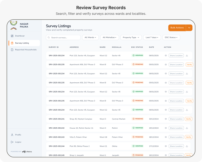
NPP Admin
Turning survey data into administrative decisions
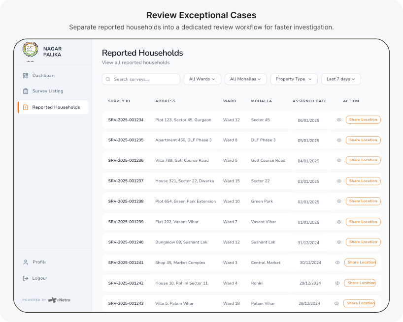
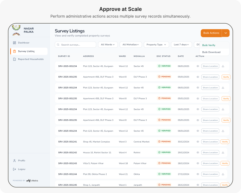
While GIS Admin focused on day-to-day operations, NPP Admin was designed for municipal teams responsible for reviewing progress and making decisions.
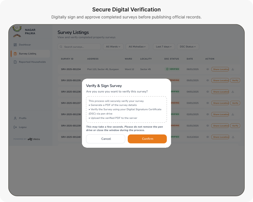
Built using Figma Make, the dashboard focused on:
Survey progress and reporting
Verify & sign survey
Bulk verify and download actions
Instead of operational controls, the interface prioritized visibility—helping administrators quickly understand what needed attention and where.
The goal wasn’t to manage surveys. It was to help administrators make faster, informed decisions.
AI Integration
Using AI to move fast where it made sense
The GIS and NPP admin systems had complex dashboard layouts with multiple views, filters, and data states. Exploring all of those manually in Figma would have eaten most of the two-month timeline.
I used Figma Make to rapidly prototype admin workflows — not to generate final designs, but to get something concrete in front of the PM fast, stress-test the information architecture, and iterate on structure before committing to full Figma files.
The field survey app was designed entirely by hand. The interaction logic — swipe-based navigation, section transitions, field-state handling — needed close control. AI-assisted generation wasn’t the right tool for that.
I used AI where it saved time. I didn't use it where precision mattered more than speed.
Signing Off!
Key takeaways
This project involved navigating ambiguity, evolving requirements, and defining structure as the system scaled.
Validation Is a UX Problem, Not Just a Data Problem
My first duplicate-check popup was technically correct — it would have caught duplicates. But it asked surveyors to do something that didn't fit how they work. The PM's pushback made me realize I'd solved the system's problem, not the surveyor's problem.
Two Months Moves Fast When Scope Keeps Expanding
New admin requirements came in after the field app was already in progress. I had to decide what to prototype quickly (AI-assisted for admin) and what to design carefully (manual for field app). That tradeoff wasn't ideal — but it was real, and naming it helped.
The most important design decision wasn’t a screen. It was understanding which problem each team actually needed solved.